
Data explorer
Interactively explore every detected object across plots, tables, cropped images, and the overview map.
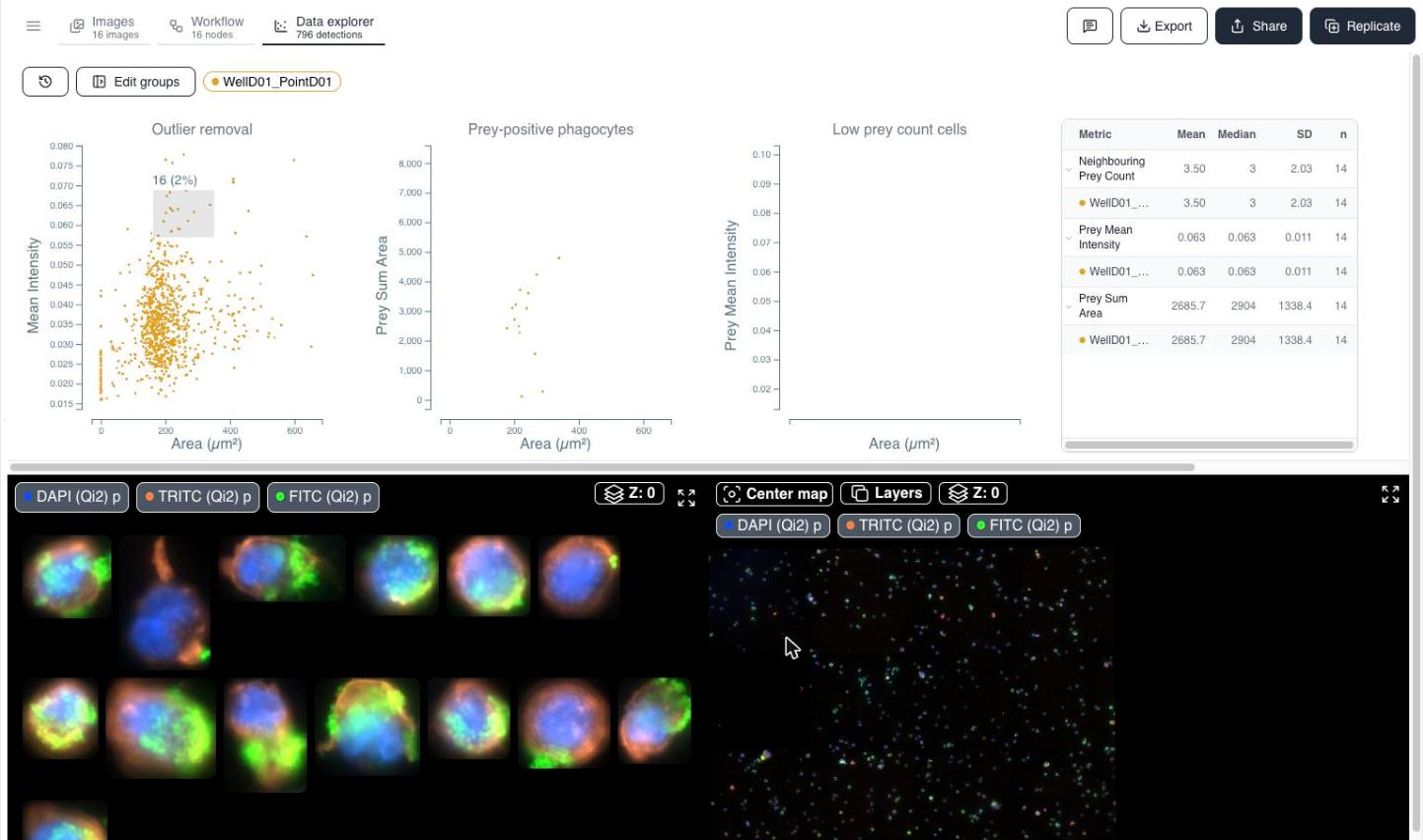
The Data explorer opens once your analysis is complete. It's the interactive workspace where cytometry-style gating meets microscopy: every plot, table, and image tile is linked to the same underlying detections, so a selection anywhere updates everywhere.
Reviewing the analysis first
Before you land in the Data explorer, Cytely asks you to confirm that the analysis is acceptable. Zoom, scroll through your dataset, and either accept with the green button or reject with the red button and a short description of what you expected instead.
The four linked panels
The workspace is split into two rows, shown below with scatter plots, a bar chart, and a statistics table on top, and cropped object images alongside the overview map on the bottom.
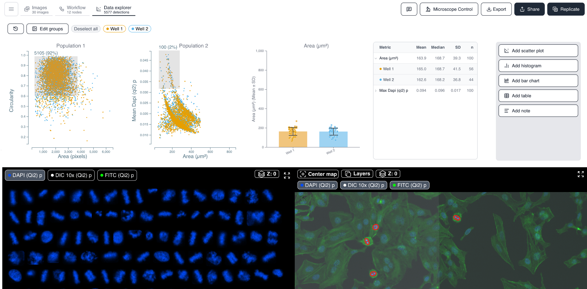
- Upper panel - plots and tables. Scatter plots, histograms, statistics tables, and free-form notes you build up to explore your populations. See Plots & gating.
- Lower-left panel - cropped images. A gallery of object thumbnails for the current gated population, so you can visually verify what a selection contains.
- Lower-right panel - overview map. The full uploaded fields with detected objects outlined, showing spatial context.
All four are cross-filtered - see Cross-filtering & inspection for how they interact.
Widgets
The upper panel is a customisable board. Add a scatter plot, histogram, bar chart, table, note, or a preset layout, and break any of them down by group. Edit columns controls which measurements a widget uses - Area, Centroid X/Y, Circularity, Major axis length, Max and Mean intensity, and other measurements.
If the workflow changes and a widget points at a column that no longer exists, the widget shows a warning card instead of a plot. Use Edit columns on that card to repoint it at current measurements or clear the stale ones.
Sample view and map view
Toggle between Sample view, which works at the object level, and Map view, a 96-well plate heatmap. Pick the metric that colors the wells (for example total detections) and read the scale from the legend - a fast way to spot edge effects or a failed well before digging into single objects.
Single-cell montage
The montage panel shows a crop per detected cell, with channel toggles so you can check a marker on its own, and a Z-slice indicator for stacks.
Groups
The tag chips at the top of the workspace (for example WellD01_PointD01) reflect the groups you set up in the Images tab. Use Edit groups to adjust them; the statistics table and plots recolor to match.
Ready to export or share?
See Exporting & sharing for how to download CSVs, save layouts, and share interactive links with collaborators.