
Plots & gating
The building blocks of an analysis in the Data explorer: plots, gates, tables, and notes.
Scatter plots
Click Add scatter plot and pick an X and Y parameter - area, intensity, circularity, or any measured feature. Add as many plots as you need; each one is a lens on the same underlying detections.
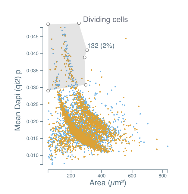
Each point is one detected object, colored by group. In the example below, mean DAPI intensity is plotted against object area, and the two wells are overlaid in orange and blue.
Gates
Drag with the left mouse button on a scatter plot to draw a gate - a rectangle or polygon selection that defines a subpopulation. Move a gate by dragging its interior; resize it by dragging its edges.
A gate is named and reports how many objects it contains, both as an absolute count and as a share of the parent population - here 132 (2%) small, bright nuclei labelled "Dividing cells".
Plots downstream of a gate update to show only the objects it contains, so chaining gates lets you narrow to very specific populations step by step - for example, "all phagocytes → prey-positive phagocytes → high-intensity prey".
Plot shortcuts
- Zoom - hold
Spaceand scroll (or use a two-finger gesture on a touchpad) over a scatter plot to zoom in and out. - Change an axis range - drag directly on the axis you want to rescale.
- Log scale - right-click an axis to switch it to a logarithmic scale.
Histograms
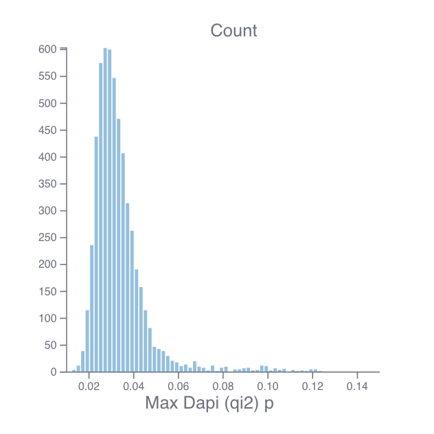
Click Add histogram and pick a parameter to see its distribution - useful for comparing intensities between subpopulations or across groups.
Bar charts
Click Add bar chart and pick a parameter to compare it across groups. Each bar is the group mean with error bars showing the standard deviation, and the individual objects are overlaid as jittered points so you can see the spread behind the summary.

Bar charts respect the active gates, so gating first and then adding a bar chart compares only the population you selected.
Statistics tables
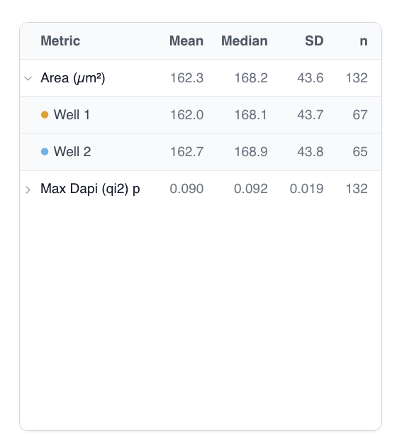
Click Add table and choose the parameters you want to summarize. Cytely reports mean, median, standard deviation, and object count (n) for the currently gated population, split by group.
Each metric is a row you can expand to break the numbers down per group, with the group colors matching the plots.
Notes
Because Cytely datasets can be shared, it's worth annotating them. Add a free-form note with Add note to capture context, conditions, and interpretation next to the data.
Phagocytosis assay table
If your dataset contains phagocytosis data, click Add phagocytosis assay to add a table of assay-level metrics like iMOP and phagocytosis score.